TLDR;
Cuebiq needed an ETL tool to automate data processing workflows within its data analysis platform. We came to call this tool Dataflow Studio. I conducted the UX design for the project, including competitive research, user flows, low through mid fidelity wireframes, user testing, and technical copywriting.
CLIENT — Cuebiq
TIMELINE — December 2020 - April 2021
TEAM — 2 designers and a consultant
ROLE — UX Research, UX Design
TOOLS — Sketch, Invision, Miro, Airtable, Confluence
Challenge
As a part of its new data analysis platform, Cuebiq needed a tool to enable data processing workflows (a core need highlighted by early MVP users). The project came with a number of constraints. Not only was an ETL product outside the team’s wheelhouse of ad effectiveness research, we also had limited time - just over a quarter for design and development. The back end was also being developed concurrently with the design process, and it was to be built upon a set of complementary, third party technologies. We had both a challenge and an opportunity to design around (and in some cases influence) the constraints imposed by these technologies.
The goal of this project was to deliver a usable, useful, and desirable interface within Cuebiq’s platform to extract, transform, and load data between databases (a data process abbreviated as ETL). As the first “from scratch” product build involving a dedicated UX designer, it was also an experiment in how we could collaborate as a team to craft the best product experience.
PROBLEM STATEMENT
Data scientists and engineers need a way to automate data workflows, freeing up their time for data analysis.
Approach
RESEARCH
METHODS
We needed to be nimble at each stage in the project in order to keep up with timelines. To understand the landscape, we dedicated a couple of weeks to foundational research before moving into mapping out user flows and discussing potential concepts.
I conducted the initial design research in three stages, each building upon the last.
-
Pattern and heuristic audits of the existing platform to understand where data was already being imported and exported, as well as inform any future improvements.
-
Foundational research on ETLs, followed by direct and indirect competitive analysis, ranging from the best known ETL products to indirectly related actions like file sharing.
-
Interview with subject matter experts and future users of the ETL product, to understand the existing user workflow and uncover any feedback.
FINDINGS
In aggregate, the research surfaced some important findings:
1. The build process needs to be flexible.
While there are some well-worn design paths amongst B2B and B2C competitors alike, ETL products need to give their users the flexibility to execute a range of dataset processing flows that we might not even conceive of as we are first designing this product.
2. Our existing platform possessed the foundations for future workflows.
We should not only leverage what is working well, but also plan to consolidate in some of these workflows in future product roadmapping.
3. System status visibility is more important than ever in an ETL product.
Both our user inquiries and market research showed the critical importance of 1) error prevention and flagging before a data workflow would kick off, and 2) setting expectations regarding timelines and status before and throughout a data workflow.
KEY FINDING
Error prevention and flagging, as well as proactively setting expectations about statuses and processing timelines, both surfaced as areas of critical importance in user research.
DESIGN & TESTING
USER FLOWS
Moving into the design phase, we started with initial user flows and scope-related questions, which we reviewed with product stakeholders, both to confirm their accuracy and suss out many of the specifics that were still being developed on the Engineering side. Through these discussions, we were able to make terminology decisions - for instance, using the term “job” to refer to a data workflow - and break the flow down into three higher level stages:
1. Initial job creation - users needed to be able to create and put initial definition around a job
2. Job activity definition - at the core of every job was the technical definition that would retrieve, transform, and deliver the data workflow users needed to automate
3. Job monitoring - users needed a way to know a job’s status once it was active in the platform
INITIAL DESIGN
Now that we had some definition around primary user flows, we met as a design team to ideate high level ideas. I distilled these into annotated, low fidelity wireframes to review with the stakeholder team. Several rounds of review with Engineering and Product surfaced important design constraints, and nudged us in the direction of mid-fidelity wireframing.
But while we were moving at a clip with designs and reviews, we were quickly approaching important deadlines. To prevent the ongoing design process from delaying front end decisions, we shifted towards a parallel working style that enabled UX, UI, and Front End to work in tandem. This required constant communication, faciliated by meetings throughout the week. In time, we reached a prototype we were confident testing with users.


PROCESS DEVELOPMENT
Optimizations to how our team collaborated, combined with rounds of user testing, ensured that the design benefited from open communication.
TESTING
The testing work was done in two phases of the design process.
In order to start gaining some early user feedback, I refined the prototype to enable a handful of key task scenarios, then crafted a research plan and corresponding Airtable base that laid out our questions by scenario. Our goal was to confirm which elements of the design were and weren’t intuitive, so in advance, we assigned pass/fail criteria to each task flow. I then filled out a “scorecard” for each group interviewed. From there, we were able to decide which changes to make and which to table or slate for later.
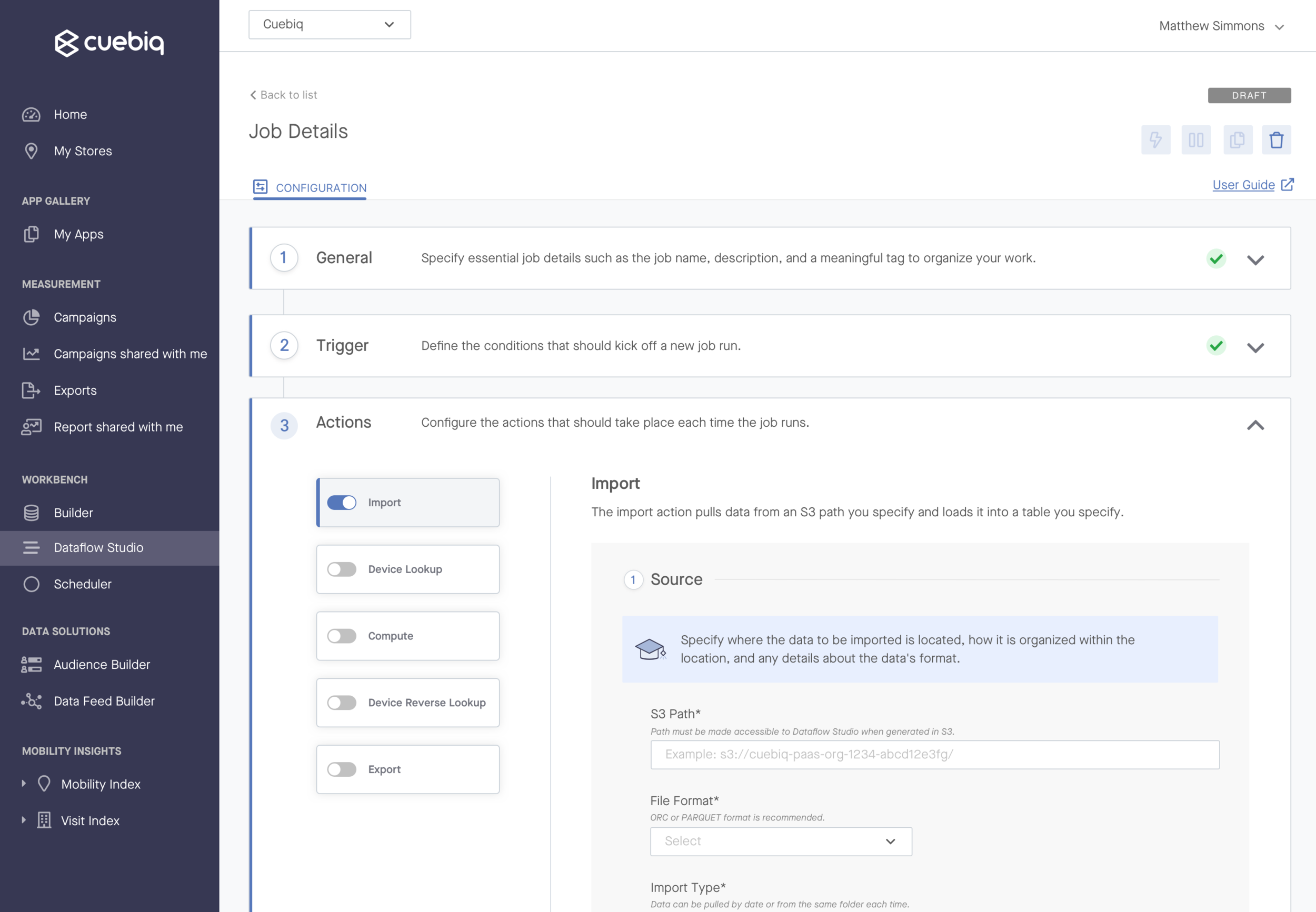
Phase 2 of testing consisted of quick hallway testing for the job’s “action” screens at a critical decision point in the design. The action screens were an area of the job build that would allow users to specify the technical details of their job - e.g. the source and destination database, as well as the script to run to transform their data. We wanted to understand whether these highly detailed screens would be easiest to use in a scrollable or wizard format.
PROTOTYPE FOR TESTING
We tested a prototype that enabled a set of predefined task flows with four different user groups.
ITERATION
In both phases of user testing, the design failed in some really important areas that enabled us to refine the experience.
Key Finding #1: Users indicated opportunity areas for the near and mid-term.
Among other findings, we learned that the intro screen came off as more of an error page than a call to action to get started, so we introduced a visually appealing intro modal that would invite the users to create their first job. We also collected some feedback that could be addressed in future iterations. For instance, several users expressed that they’d like to kick off a job run based on a custom script rather than just a certain date and time.
Key Finding #2: Users preferred to see all technical specifications in one page.
We suspected that a long, scrollable format would be overwhelming, and that parsing the work out might be less likely to overwhelm users. However in speaking with users, we actually found the opposite - they preferred to see all the information in front of them in one long, scrollable screen.
Results
FINAL DESIGN
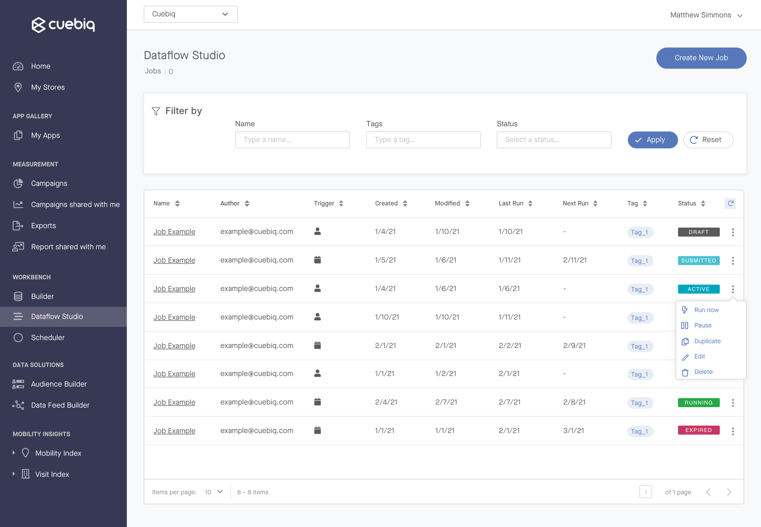
We released the MVP in April 2021 to a positive reception amongst early users. The final design included the core features users needed to run jobs, including:
Creating, editing, and activating a new job from scratch
Setting a job to be run manually from the platform, or determining a recurring schedule for job runs
Key job actions like saving and editing a draft, pausing, and duplicating
Technical steps allowing users to configure data import, export, and transformations
Notifications to communicate key status changes at the job and run level


REFLECTION
NEXT STEPS
Since the MVP release, we’ve had the opportunity to improve upon the product based on user feedback, including enhancements like:
Canceling a run that’s already begun
Surfacing job versioning details
We’ve also created high level concepts for possible larger feature releases, like:
Adding additional job templates and allowing users to browse/select before entering the job build
Introducing higher impact welcome screens, e.g. in video form
By maintaining continuous contact with early MVP customers, our Product, Engineering, and Design pod is also able to address and plan for user pain points that have arisen since the product’s release. We’ll continue to address these points as we go to continue to enhance the initial product.
KEY LEARNING
Every project will be an opportunity to iterate on how we collaborate to create products users love.
LESSONS LEARNED
My biggest learnings from this project were around the team working style, and a lot of that has to do with this having been our first ground-up product design and development that involved a dedicated UX Designer. I had a really positive experience with collaborating in parallel, and I’d like to mimic that style in future projects. I also gained a ton of insight into working closely with Engineering, considering the technical complexity of this product.
One thing I’d do differently next time would be to conduct more discovery research with users going in, time permitting. This would require larger organizational changes, because it requires significant project lead time.
For now, we can take this initiative as a baseline for how UX practices can be infused with the current team, and continue to iterate on how we collaborate together in future projects.


